
The difficulty in writing my column is not about finding work to highlight, but in winnowing down the 150 to 200 pictures I bookmark and favorite each week to just the 10 or so that I focus on in a column. If one of the bookmarked pictures is someone I have not highlighted before, they tend to stay on my list because frankly, there are a few people whose work deservedly could make the list each and every week, but the goal of my column is to highlight more artists and bloggers – not just those whose work knocks my socks off week in and week out.

The Second Life artist I want to highlight this week is Zach Larsen whose work is so varied and fun. I love the angle he chose for this shot of Pier 10. He took a more conventional shot as well, but this angle is so intriguing. I love the way the clouds seem to be paintedon the water, the lovely concentration of sunlight reflected in the upper corner and how the picture seems framed by the wood both vertically and horizontally. it’s an incredible photo and certainly goes on my list of all-time favorites.

Shall We Dance is another striking photo. Note how he divides the picture into thirds with the sky, water and sand. The contrast in the positions of the two avatars is so interesting. There he is standing relaxed, at rest and at ease while she is captured in movement, her shoulders and arms arched. There’s kinetic tension in her pose and we want to know what’s next. Either avatar alone on this beach would be a pretty picture. The contrast between the two together makes an interesting picture.
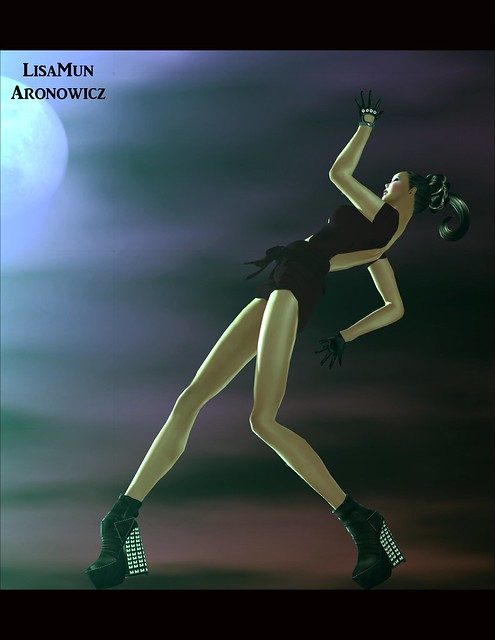
I love this photo from LisaMun Aronowicz for SL Extravaganza. I like how the line of her body on the left bisects the frame diagonally and the strong geometry she creates with her posed arms and legs. I also like the way her pose places her in relation to the moon, as though the mood makes her body’s angle wax and wane like the tide. It’s a striking photo and one that made me stop to think about it and enjoy it even when it was thumbnail size.

This photo from Miaa Rebane for Avenue Magazine has such stark regality to it. I love the long angled walls leading to the subject and how their diagonal lines draw us in. I love the pose, the crossed arms and upright bearing seem to challenge us, warning us that this is no person to be trifled with.

This unedited photo from Ravenelle Zugzwang is a fun example of how much can be done with light and your Second Life camera without ever opening up an editing program. A little glow on a prim can do more blur and airbrushing than you could believe without actually playing around with it in-world. Shooting in a setting with a lot of glow, you have to have the courage to let go of control and just allow the picture to be. I love that she did that.

I like this picture from Marja Languish for Crazy in Second Life. I really think her side eye makes this picture something special. She has such a traditional pinup pose and coupled with the lingerie, this could have been a very standard cheesecake picture, but the vibrant hair, the wild tattoos and that hellcat on wheels expression on her face take this in another direction. It’s fun, it’s sassy and wildly pink!

I love this photo from Katya Valeska for Simply Dou with the high contrast between the bright lights and dark shadows. This really brings the gorgeous print of the dress into high relief, making it the star and the focus of the photo.

I love this new take on yin and yang from Nymeth Vale for Flibbertigibbet. I love the many contrast she incorporated, the updo versus the long flowing hair, the socks very bare feet, the elfin ears and the plain ears, the pale skin and the tanned are all differences in these “twins” . The shadow highlights unity while they exemplify difference.

I love the light in this photo from Rainey Manx for No Rainey Days. I also like the use of depth of field to soften her shouder and the lines of the chair . I like the angle and who she looks right at us while turned into the frame. I also love how the inky blackness is not so absolute that we cannot see the the shadows cast on the floor. That’s amazing detail that makes this really stand out.

This photo for Bestyle Magazine by Florence Babenco is breath-taking. I always love it when artists trust us to complete the picture. It’s an effective technique because our brains are amazing and will fill in everything that is missing. There’s such foreboding in this photo what with the raven and the angled windows of the building in the background suggesting decay and destrution, yet her dress is so vibrant and alive. What is her story?

This picture from Serene Fairey for slTransfusion should be seen on a white background in order to be appreciated at its best.This photo has been lighted so much that we have to work to see the details, but they are there. I like the ethereal insubstantiality of it all and think it is so fitting for a picture of an angel. Especially an angel with an arrow to the knee.